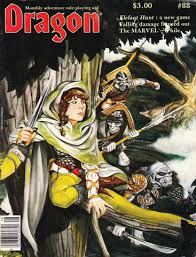
Like many of you, my first exposure to Iron Crown Enterprises was through advertising in Dragon Magazine. Looking back at the ads, they seem simplistic and perhaps crude in their execution, but then they were strangely compelling. A combination of ad copy and art effectively conveyed the “gritty” and “realistic” feel of Rolemaster.
I thought it would be interesting to go through some of the very first ads in Dragon and explore how they changed and progressed over time. One thing to note–ICE had page #3 for all of their ads so it was one of the first things readers saw. That probably helped alot.
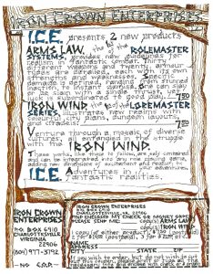
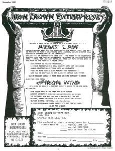
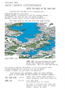
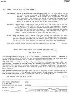
Iron Crown Enterprises very first ad was in Dragon Magazine #40 from mid 1980. I don’t recall this one as my very first Dragon was #46. Obviously hand drawn and colored using the runic script that ICE had in their early product versions (arms law, spell law, iron wind). Interestingly, this ad featured both Arm’s Law and the Iron Wind. Two things of note: this is only 1 of 2 ads that incorporated color and this first ad did not have their Iron Crown graphic.
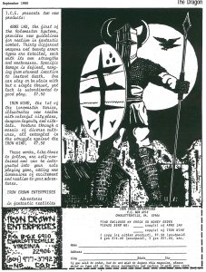
This ad is just awesome! The large warrior, the hawk in the background, a spear and wooden shield. It’s very similar to the Syrkakar warrior in the Iron Wind and I’m guessing it’s the same artist. This ad adopts the bleak black/white aesthetic that ICE maintains for almost all their Dragon advertising. Just cut out the order form, include a check and mail it off! Those were the good old days. Still no Crown Logo though…
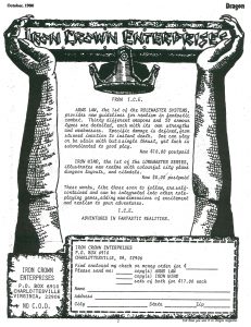
And there it is…the Iron Crown logo!!! This is mostly the same ad copy as the previous month. I find the ad a bit bland but you start to see the logo and company name style being established. Notice the talons on the hands holding the logo.
This is a slight variation on the previous month but it starts to highlight some RM rule differentiation. But first, it’s the first use of the Arms Law tag line (below the crown, may be hard to read):
“Because a mace is not an arrow or a scimitar, there is …”
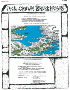
So this is only the second ad that uses color in Dragon Magazine. This is notable because it features Pete Fenlons cartography style and evokes the topographical Tolkien style map. A huge leap from the cartoonish hex maps being used in D&D. Notice that they dropped the Iron Crown graphic.
Similar to the previous month, but shows the growing professionalism in ICE’s ad design. The monolith border frames the ad and eliminates the blank margins and the copy is mostly done in typeset fonts rather than script style. This ad does not include the Iron Crown graphic.
This feels like a step back. Although the stone borders evoke the early Arms Law cover it’s all copy and no real graphic. It seems like ICE wanted more space dedicated to explaining and describing their rules and setting. A lot to read! 2 Iron Crowns though!
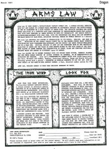
Ughh…what happened here? This seems like someone just wrote some stuff with a typewriter and mailed to Dragon. No graphics, art, logos… Terry, if you read this do you remember how ad design decisions were made? Why not just repeat a previous ad?
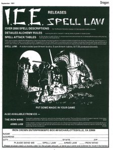
After several months of repeating past ads, ICE used this ad for the introduction of Spell Law. OVER 2000 spells!!!!!! I know that caught my eye back then. This was the first of a series of ads that used white lettering and dense combat vignettes on a deep black background for contrast. Love this art–anybody know who did them?
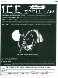
The next month a similar ad with slightly different art. I like this because it shows the character on the right casting a spell onto the other figures sword! Simple but implies so much about the RM spell system.
Updated. 1/12/2020.
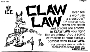
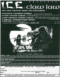
Not sure how I missed this, but what a curious, non I.C.E. advertisement. Looking at subsequent Dragon editions, this appears to be a filler ad for space above the 2/3 page for Hobby Game Distributors. My guess is that Claw Law was being introduced but they didn’t have a full page ad ready yet. The staff at Dragon put this together using the line drawing “cartoon aesthetic” common at the time.
For me, this was one of I.C.E.’s most iconic ads. Again the sharp white on black background contrast. A single warrior against a pretty formidable looking foe. The large moon in the background. Of note is that like many of ICE’s artwork the warriors presented seem rather under-equipped. No platemail armor, huge swords, glowing magic items. Mostly spears and wooden shields. I thought that also implied a lot about the game mechanics and really intrigued me before I started playing RM.
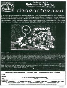
The last piece of the Rolemaster system: Character Law! Plus this ad is the permanent return of the Iron Crown logo. This artwork feels very “D&D”: a more traditional armored warrior with a shield and a funny looking monster. hmm.
So that’s a quick look at some early ICE advertising in Dragon Magazine over a 2 year period. Later ads introduced MERP modules, and the Loremaster series. The Loremaster ads was interesting because it announced Cloudlords of Tanara as the first module in the “new line” with upcoming modules being the Iron Wind, Vog Mur and Shade despite the Iron Wind having been one of ICE’s first products.
What’s your favorite I.C.E. ad?

I started getting Dragon a bit later – I’m not actually sure when as I picked up a lot of back issues, but sometime after 100 I think. By about 120 I had a subscription so in that period. One thing I noticed not that long back on the back cover of a Dragon (an undead special, probably in the 110s or 120s) was a full colour ad for Court of Ardor. For $4.95. Even in the UK that wouldn’t have been much, probably £5. Wish I’d picked up a copy!
Neat retrospective! I remember the 1980 ads, and one or two of the later ones. I remember first hearing about ICE and Arms Law at Gen Con- I want to say 1980, but maybe it was 1981. I was in high school (don’t do that math) and my DM was really excited about the combat charts. He didn’t start using them, though, it was a couple years later that our group switched DMs and that new DM decided to switch wholesale to ICE.
(My favorite here is probably the 1980 warrior with shield – I remember that one best.)
What was that map of? I don’t recall if it was ever used in a product or not. It looks very nice.
Good question-the color parchment version of the Iron Wind? Ill check my copy.
The Gulf of Finland viewed over Lake Ladoga, from the northeast? Except that whole area is flat as Nebraska.